


Why Your Landing Page Matters
Your landing page is often the first (and sometimes only) chance you get to convince someone to take action — whether that’s buying a product, signing up for a newsletter, or booking a service.
But here’s the truth: most landing pages fail because they’re cluttered, confusing, or not built with conversion in mind.
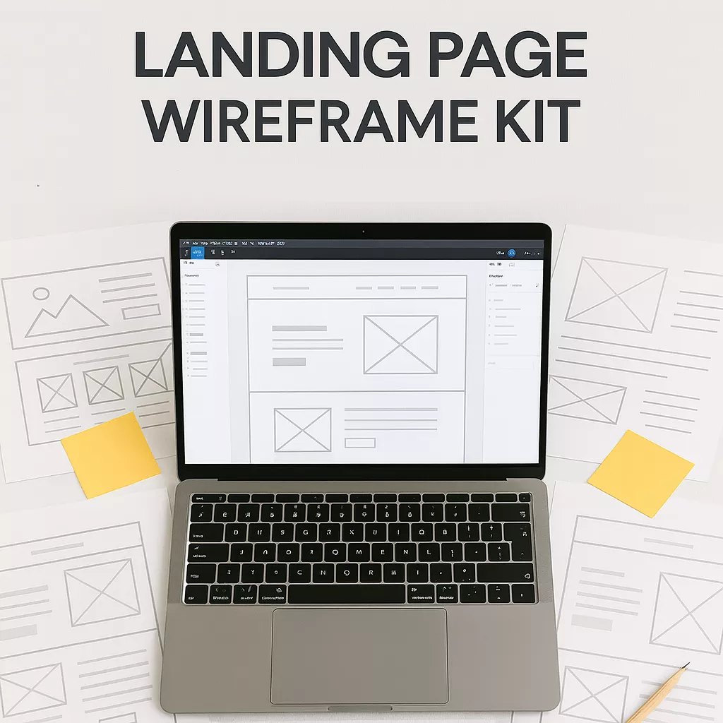
At Diamurra Media, we believe simplicity sells. That’s why we designed the Landing Page Wireframe Kit, a proven set of layouts and components built to help entrepreneurs and creators design landing pages that convert — even without a designer or coder.
Let’s break down exactly how to do it 👇
1- Start With One Clear Goal
Every great landing page begins with a single, focused purpose.
Ask yourself:
“What do I want visitors to do on this page?”
Whether it’s buying a digital product, joining your list, or booking a call, that goal should guide your layout, copy, and visuals.
💡 Pro Tip: Remove anything that doesn’t directly support your goal — one CTA (Call-to-Action) always performs better than many.
2- Create a Strong, Benefit-Focused Headline
Your headline is the first thing visitors see — it needs to grab attention and clearly communicate value.
Instead of “Welcome to My Website,” try something like:
“Build a Stronger Brand Online — No Coding Required.”
A powerful headline instantly tells users what’s in it for them.
⭐ Try this:
The Landing Page Wireframe Kit includes headline formulas and pre-tested examples for higher conversion rates.
3- Use Engaging Visuals That Support Your Message
Images and graphics should make your offer more appealing, not distract from it.
Show your product in action — mockups, screenshots, or even lifestyle photos help visitors imagine themselves using it.
🎨 Design Tip: Stick to 2–3 brand colors and keep plenty of white space. Clean layouts always convert better.
4- Highlight Key Benefits (Not Just Features)
Visitors care less about what your product is and more about how it helps them.
Turn every feature into a benefit:
- ❌ “Includes 10 templates”
- ✅ “Save hours of design time with 10 ready-to-use templates”
Clear, benefit-focused text helps visitors connect emotionally with your offer.
5- Add Social Proof and Trust Signals
People trust people — not websites.
Adding testimonials, ratings, or logos from past clients can dramatically increase conversions.
If you’re just starting out, show your results, before/after examples, or numbers (“Over 500 entrepreneurs use our templates”).
💬 Add even a single quote:
“I built my first high-converting page using Diamurra’s kit — it doubled my sales in a week.”
6- Make Your Call-to-Action (CTA) Stand Out
Your CTA is where conversions happen — make it clear, visible, and action-driven.
Good examples include:
- “Download Now”
- “Get Instant Access”
- “Start Growing Today”
💡 Placement Tip: Repeat your CTA at least 2–3 times throughout your landing page — top, middle, and bottom.
7- Test, Refine, and Optimize
No landing page is perfect the first time — even pros test and tweak constantly.
Try different headlines, button colors, and CTA placements. Small changes can lead to big results.
📊 Pro Tip: Track your conversions using Google Analytics or simple spreadsheets (like the one included in the Digital Growth Blueprint).
Final Thoughts
A high-converting landing page doesn’t need to be complicated — it just needs to be clear, focused, and built with purpose.
If you follow these steps and use a proven structure, you’ll turn more visitors into customers — without endless trial and error.
👉 Ready to build your perfect landing page?
Download the Landing Page Wireframe Kit from Diamurra Media and get access to ready-made layouts, drag-and-drop Figma components, and conversion-tested structures — all in one instant download.